Now we had an idea of what we wanted our show to be about and the structure of it, we started to discuss the aesthetic of the piece to create a clearer idea of what the show would look like. As a creative designer, I was responsible for the set and the costuming within our show and began to look at different ways scenography could reflect the themes we were exploring.
When considering the set of our piece, it seemed imperative to fully utilise the space that was available to us; in order for us to showcase the themes and aims of our show and theatre company as a whole. When deciding the overall aesthetic within a theatre production the space is a blank canvas to enhance in a way that the show requires. When creating a set, you have the power to ‘make it and break it, what we need to [do to] create the right space and how it can be constructed with form and colour to enhance the human being and the text’ (Howard, 2009, 1). I wanted the set of our piece to compliment the actors in relation to our theme, and work simultaneously with the actors to create the overall feel of the show.
Taking influence from other theatre sets that explore scaffolding
(Pinterest, 2017) (Wilhelm Layher GmbH & Co, 2014)
At this point, our show is focused around the idea of being able to escape everyday issues many people suffer from through different forms of escapism, such as music, reading and writing. Even though ideas are still within the developing process, we know that there will be one main narrator character that will feature throughout, and the setting of the piece would be within this characters ‘world’. As we wanted the set to represent this ‘world’ that the character was creating, altering and manipulating throughout our show my first thought was to use some form of scaffolding. The use of scaffolding signified the narrator’s ‘hands on’ construction of this world, perhaps with the idea that this world is the narrator’s very own escape from his problems.
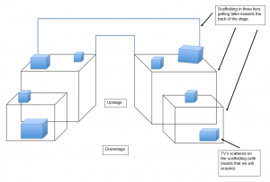
Initially, my set plans, included a tower of scaffolding positioned along the width of the stage at the very back, with two slightly smaller towers of scaffolding at either side of the stage.
A rough sketch of our initial set layout
(Goddard, C, 2017)
Another aspect of the set we wanted to include was a variety of old and new televisions placed throughout the whole of the stage. This was to indicate an idea that though the media is surrounding our lives constantly, people will continuously have individual personal issues that they want to escape. Therefore by using the towering scaffolding this creates a distance between the actor and the televisions that are placed on them at different heights. This proposes the idea that the character is surrounded by not only all of the conflicts seen in the media but also their individual problems creating some form of entrapment for the character. This could consequently contradict the theme of escapism and sadistically suggest there is never any real escape from issues in everyday life.
Works Cited
Goddard, C. (2017)
Howard, P. (2009) What is Scenography? Abington: Routledge. Available from: https://books.google.co.uk/books?id=0Kd9AgAAQBAJ&printsec=frontcover&dq=scenography&hl=en&sa=X&redir_esc=y#v=onepage&q=theatre&f=false [Accessed on 4th March 2017].
Pinterest (2017) Pinterest [online] Available from: https://uk.pinterest.com/pin/147141112804219575/ [Accessed on 4th March 2017].
Wilhelm Layher GmbH & Co. (2014) Layer. [online] Available from: http://www.layher.co.nz/scaffold/rent-scaffolding-set.html [Accessed on 4th March 2017].


Leave a comment