Although social media is a key element of my marketing strategy it is not the most important. Printed advertising is essential to successful marketing and this made me strive to create a poster and flyer of a high standard. It is important to remember when creating promotional materials “to keep … advertising simple and relevant to the product, and to make sure it is effectively targeted” (Hill, O’Sullivan and O’Sullivan, 2003, 195).
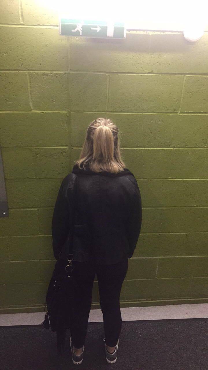
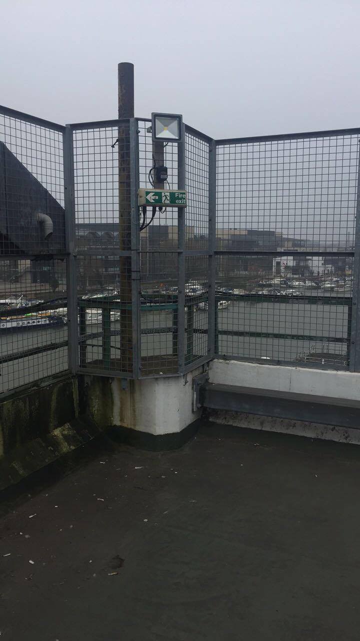
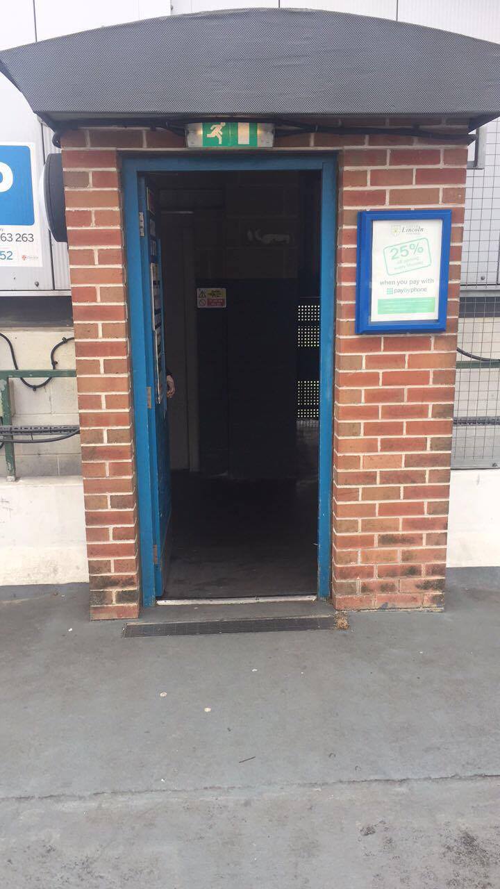
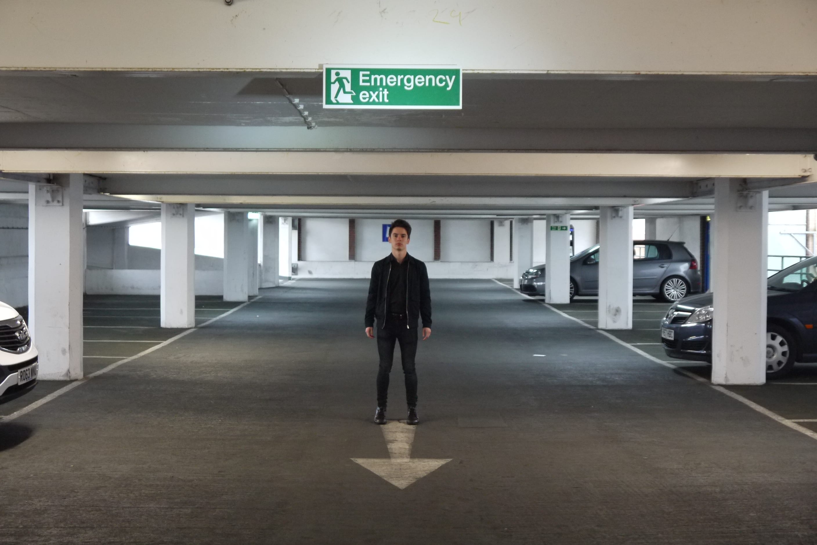
In a meeting with our director Joe Turner and assistant director Brodie Atkinson we discussed that our poster needed to illustrate the sadistic side to escapism but have hints of the fun elements that are within our show. For me it was essential to have a person in the poster as more people are attracted to a poster where you can see a face. As the production was called ‘Exit This Way’ I was keen to find an interesting backdrop for the shoot. As our lighting designer Ben was researching warehouses as a stimulus for lighting, I wanted to utilise this for the poster. So I went on a tour around Lincoln to find warehouse styled spaces with a fire exit sign.
Poster Set Options 1 (Nixon, 2017) Poster Set Options 2 (Nixon, 2017) Poster Set Options 3 (Nixon, 2017)
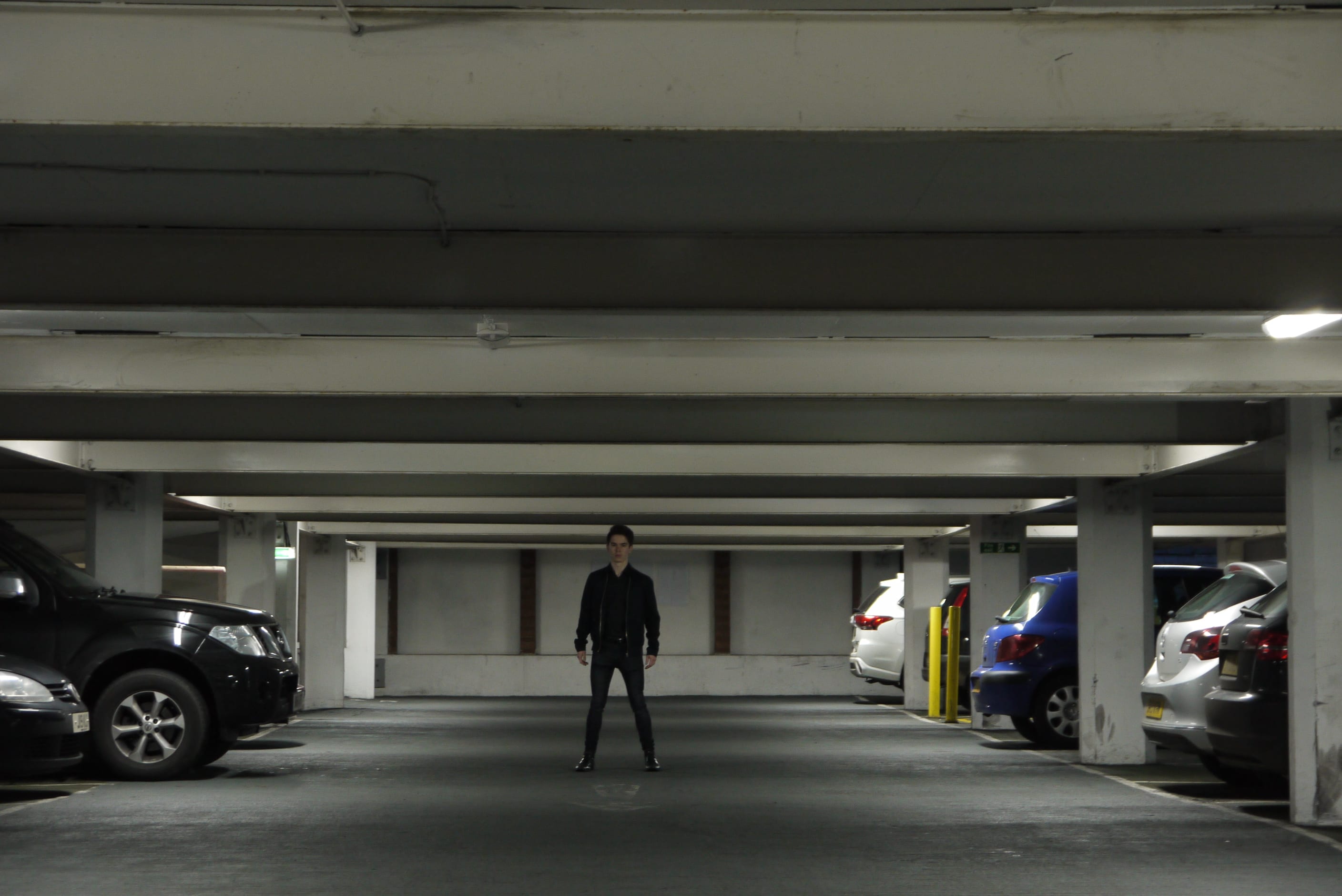
The location I decided to use was a car park as the lighting created a warehouse effect and also created a sense of unease which the limbo section in our show also generated. I chose to use Rob as the figure in the poster as he was the presenter character who was serious, focussed and created the world of escapism for the “contestants”.
Poster Option 1 (Nixon, 2017)
Poster Photo Option 2 (Nixon, 2017)
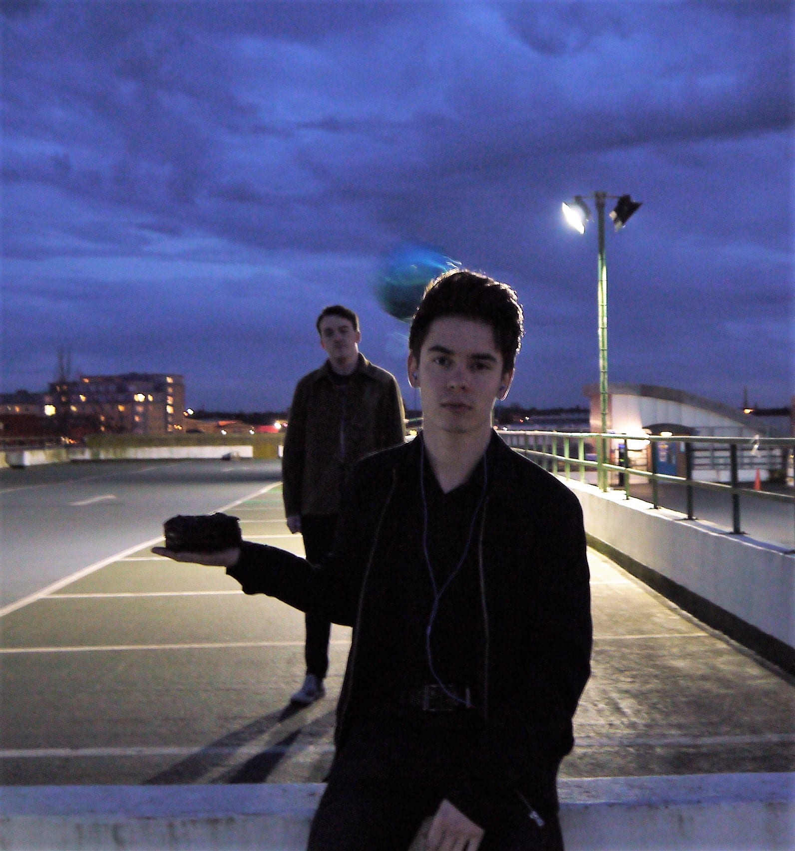
These images did not come out as I had hoped due to the cars taking away the focus of Rob and it also didn’t show the fun elements that consisted in our show. I decided to do a reshoot for the poster and changed location to the top floor of the car park and brought in Brodie who was the other presenter in the show. I also added a cake, balloon, pen, and headphones to show the four areas of escapism in the show.


Poster Photo Option 3 (Nixon, 2017) Poster Photo Option 4 (Nixon, 2017) Poster Photo Option 5 (Nixon, 2017)
This is the final poster:
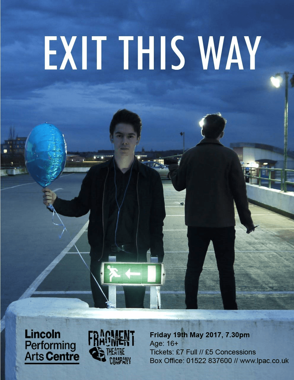
Exit This Way Poster (Fragment Theatre Company, 2017)
At first I found it very difficult to make the poster as I had to teach myself how to use Photoshop. Luckily I had a strong image that did not need editing or any effects layered on the image. I decided to use a simple font as the image was the most important element to the poster. The fancier the font the less effect the image had.
At the start of the process our show had a more serious tone but as the show progressed it veered more towards a tongue in cheek style comedy. Although the poster still represents our show it steers more towards the undertones of the sadistic elements. If I could have created the poster at the end of the process it would highlight more that our show was a comedy.
Another marketing strategy we used was flyers! This is a great marketing method as “face-to-face contact is made… you physically hand out” (Layton Turner, 2006, 193); the flyers having personal contact with your audience. The more warm and friendly you are the better the reputation of your company. This will lead people to wanting to come see your show as they have a good first point of contact with you. For the flyers we again used the poster image to keep a consistent image going throughout all the marketing materials.
Fragment Flyer Side 1 (Fragment Theatre Company, 2017)

Fragment Flyer Side 2 (Fragment Theatre Company, 2017)
Works Cited:
Fragment Theatre Company (2017) Exit This Way Poster
Fragment Theatre Company (2017) Fragment Flyer Side 1
Fragment Theatre Company (2017) Fragment Flyer Side 2
Hill, E., O’Sullivan, C. and O’Sullivan, T. (2003). Creative arts marketing. 2nd edition. [ebook] Oxford: Butterworth-Heinemann. Available at: http://lists.library.lincoln.ac.uk/items/EB051E65-5BD4-50A0-63E2-4A766F27A8E8.html?referrer=%2Flists%2F2F819BDC-9061-08EC-AD65-4A8AF646E284.html%23item-EB051E65-5BD4-50A0-63E2-4A766F27A8E8 [Accessed 31 Mar. 2017].
Layton Turner, M. (2006). The Unofficial Guide to Marketing Your Small Business. 1st edition. New Jersey: Wiley Publishing, Inc.
Nixon, E. (2017) Poster Photo Option 1
Nixon, E. (2017) Poster Photo Option 2
Nixon, E. (2017) Poster Photo Option 3
Nixon, E. (2017) Poster Photo Option 4
Nixon, E. (2017) Poster Photo Option 5
Nixon, E. (2017) Poster Set Options 1
Nixon E. (2017) Poster Set Options 2
Nixon, E. (2017) Poster Set Options 3
Leave a comment