More Than Just a Costume?

The use of costuming is often overlooked as an element within theatre and has been purely regarded as an added embellishment to the stage. However ‘we can consider the power of costuming to shape identity’ (Monks, 2009, 3), which proves an important aspect in the creation of characters within a show, offering the audience a greater insight into who that character is.

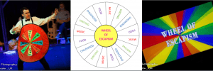
At this point in our process, we wanted each character to have a clear costume to display that person’s personality and to make it obvious that the focus of the show was now targeted on this particular character. Our show is centred around the key prop which is named as ‘The Wheel of Escapism’, which ultimately decides the structure of the show by randomly selecting which section will be performed at what time. Each section of the wheel had a different theme and a different colour, for example the food section would be a purple segment with the word ‘food’ written on it. This prop influenced each characters costume vastly, as the colours of each characters outfits had to compliment the colour of each section. This was to enhance the idea of the game show aesthetic we were looking into using as it implies that each character can be seen as a team competing to win this escapism game show.


Wheels

The end result of the costume/prop ‘The Wheel of Escapism’ (Odonnell, 2017)

An initial sketch of ‘The Wheel of Escapism’ (Goddard,, 2017)

The logo for ‘The Wheel of Escapism’ (Odonnell, 2017)


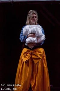
Each characters costume symbolised their way of escaping through the assigned colours. For example, the character of Laura escapes through childhood games, such as building a fort in her run down adult flat to avoid her adult responsibility of being in debt. Hence Laura’s costume would be something that she would wear whilst relaxing at home, e.g. a dressing gown.

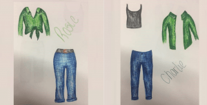
There’s a heavy use of colour applied to each characters costume apart from the two hosts character that were recently created. This was because the host characters were in charge of this world and held the power over the other characters, therefore the difference between them and the other characters needed to be apparent. To portray this, they were dressed in formal suits to signify their importance and their passive colours of black and white helped to emphasise the fact that they were not participating in the game show.
Fianl Costumes 2

Final costumes

Sketches of the costumes for each character

(Goddard, 2017)

Works Cited:

Goddard, C. (2017)

Monks, A. (2009) The actor in costume. Houndmills, Basingstoke: Palgrave MacMillian, United Kingdom.

Odonnell, S. (2017) Fragment Theatre Company. Lincoln: SO Photography.
Influences to Our Process

As a group we were slightly over stimulated by the amount of different ‘escapes’ that we as a company could explore. We were able to combat this problem by using an exercise which was taught to us in a workshop by Flickbook Theatre that I like to call ‘The Idea Tree’

8

The Idea Tree (Turner, 2017)

The premise of the idea tree is to take an area of exploration such as ‘Gaming’ or ‘Religion’ and go onto the Wikipedia page for that word. By clicking on the hyperlinks on that page we were able to create a train of thought sprouting off from that word. An example of this is ‘Gaming’ which became gaming therapy, anxiety, fear and Hypertension giving us new avenues to explore if and when we looked at gaming as a means of escape in the show.

Flickbook are also well known for their use of narration, something which I thought could used to our benefit in the show. Through having to explain an event in our lives including all the detail of the room, the furniture, the people etc. I was able to gain a better understanding of how the intricate details of the description is what makes an audience member visualize said space/event. This technique was implemented in the show within the childhood section in which Chloe described the room around her and minimal props and costume were brought on to help the audience visualize the space.

Chloe

Laura after her childhood escape (Odonnell, 2017)

One thing that I was overly aware of was the need and the necessity to go and watch other theatre companies perform in the LPAC to broaden our horizons as a company and help pinpoint our own interest and inform our work. For example, the shows Focus Group by Toot and Wail by Little Bulb introduced us to the notion of direct address of the audience which in turn led us to the idea of our piece adopting a Postdramatic style (see next blog post).

Once we began working with the meta-theatrical ideas of Postdramaticism, I noticed that we were beginning to lose the individual and personal narratives which we started the process with. This was the case until a workshop and lecture with Third Angel Director Alexander Kelly on the 6th April. In his talk Kelly spoke about how he came about creating some of his shows and how he used real life stories from real life people and how “the truth is better than any fiction you could create” (Kelly, 2017) which prompted us to go back and look at the original escapes and personal experiences which we began the process with.

Works Cited:

Kelly, A. (2017) Discussion of Third Angel and Contemporary Performance [lecture]. University of Lincoln, 6 April.

Odonnell, S. (2017) Laura After Her Childhood Escape. Lincoln: SO Photography.

Turner, J. (2017) The Idea Tree. 

Rob – Actor, Writer, Character?

Our company has recently made the decision to include Brodie as a second narrator, alongside my own character. This decision has been made to enhance the post dramatic style we intend our piece to have.

We plan on using these two narrators (who will be heightened versions of Brodie and I) to explicitly ‘create’ scenes and characters when establishing the four sections of the show (which are childhood, food, writing and music) through fast paced and possibly comical dialogue. The two of us have been selected as actors due to the contrast between our serious and comical natures, which I believe exaggerated on stage, will give us the potential to create enjoyable, energised characters who can be used to set and maintain the pace of the performance.

The intermediate space in which these playful interludes between the different sections will occur has been titled ‘limbo’. This ‘in-between’ space may also adopt themes from an initial idea of including a ‘video game’ or ‘game show’ section as a form of escapism, which will be documented once our technical designer uploads his mood boards to the Technical Documents page of our blog. I believe this deliberately playful aspect this will convey the narrators as a form of ‘game show hosts’ when ‘creating’ the different sections.

This challenges my role as an actor, as for this performance I will be portraying a heightened version of myself as the ‘game show host’ styled narrator, which will entail breaking in and out of moments of ‘polished performance’ and ‘rehearsal discussions’. The difficulty here will be creating a distinct ‘switch’ between these states through either gestures of use of voice, or both.

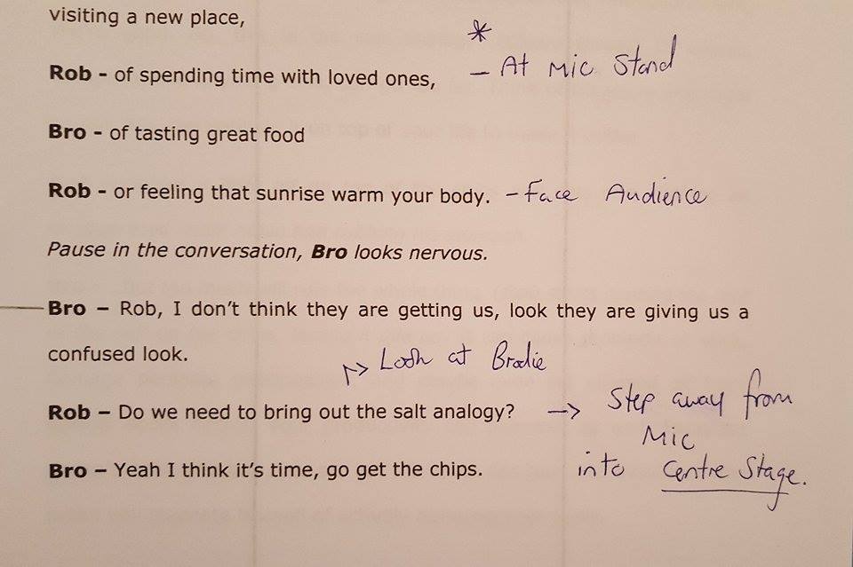
Whilst scripting and rehearsing the dialogue between the narrators thus far, I have been identifying specific lines which signify the change between the ‘polished’ and ‘rehearsal’ moments to help myself differentiate these switches in pace and tone of delivery.

annotated script

Figure 1 – Annotated Script (Anthony, 2017)

During rehearsals this week as shown in the above video, we have also experimented with these changes in the narrators dialogues being accompanied by a physical movement either to or away from the proposed microphone stands the narrators will have either side of the stage, to reinforce the idea that the polished performance moments are ‘pre-meditated’ and therefore delivered through the microphones, with the ‘rehearsal conversations’ being delivered in the space between the microphone stands at the front of the stage, at a slower pace to extenuate the illusion that these lines are being thought of in the moment.

Throughout the following weeks I will continue working on the distinction between ‘Rob’ as the ‘polished and prepared narrator/game show host’ and ‘Rob’ as the ‘narrator/game show host in conversations/rehearsals’ during the different sections of the script.


Figure:

Anthony, R. (2017) Annotated Script. Lincoln.

Exit This Way?

Creating the name of a show or piece of theatre that had yet to be completed proved more difficult than we initially thought. Though we now had a basis for our show, a complete script was not yet complete and ideas were still being continuing altered.

Through the name of the show we wanted to indicate what the performance was about and what our theatre company stands for, without giving too much away. The name needed to hold a sense of intrigue for potential audience members to entice them enough for them to take an interest in without giving too much away.

Though we had a rough basis for our show, the theme of escapism, and an idea towards the fragmented structure, the rest was still in development and yet to be decided. This consequently made it more difficult to name as it needed to represent something that did not yet entirely exist.

When thinking about ideas regarding the name, the main theme that appeared to me, was the idea that ‘escaping’ is in some way leaving reality into what feels like a safer fantasy. This appeared ironic as theatre itself is a form of escapism for many people, including myself, as it helps to forget your own reality and become absorbed into the spectacle of theatre and the performance. As is the profession of acting as a person escapes their own identity to be become another through within a show.

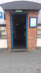
‘Exit This Way’ came from the glowing, green sign obvious to see in the LPAC auditorium, the very setting the show will take place in. As ‘exit this way’ is a common phrase often used in everyday life, it occurred to me that escaping is something normal that many people do daily also. ‘This way’ also suggests there are multiple ways of leaving or escaping and not everyone does it the same, a key theme that is shown throughout our show.


exitsign


Exit This Way sign that inspired our show’s name

(Exit This Way, 2016)


The imperative in the title also suggests escapism can be powerful and dominating over a person’s life. This is also portrayed throughout our own show as the character of the host appear to somehow own and construct this world that is built on the stage throughout the show and could represent someone’s own controlling thoughts.

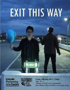
We further tried to show this aesthetic through our poster for the show. The idea regarding the poster was to show the idea that the narrator had a greater power than the other characters in the show and had the ability to influence the way that people escaped. Working with our marketing manager, we decided that as our show was exploring the serious topic of escapism, however through a comical style, the poster and name itself needed to imply this.


FRAGMENTPOSTER

Our finished poster

(Nixon, E, 2017)


Works Cited:

Exit This Way (2016) Exit This Way. [blog entry] 30 August. Available from http://nerissagolden.com/2016/08/exit-this-way/ [Accessed on 1st April 2017].

Nixon, E. (2017)

One Cold Night at the Top of a Car Park

Although social media is a key element of my marketing strategy it is not the most important. Printed advertising is essential to successful marketing and this made me strive to create a poster and flyer of a high standard. It is important to remember when creating promotional materials “to keep … advertising simple and relevant to the product, and to make sure it is effectively targeted” (Hill, O’Sullivan and O’Sullivan, 2003, 195). 

In a meeting with our director Joe Turner and assistant director Brodie Atkinson we discussed that our poster needed to illustrate the sadistic side to escapism but have hints of the fun elements that are within our show. For me it was essential to have a person in the poster as more people are attracted to a poster where you can see a face. As the production was called ‘Exit This Way’ I was keen to find an interesting backdrop for the shoot. As our lighting designer Ben was researching warehouses as a stimulus for lighting, I wanted to utilise this for the poster. So I went on a tour around Lincoln to find warehouse styled spaces with a fire exit sign.

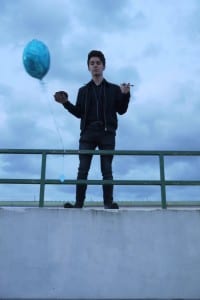
18789614_10210811860507334_610580570_o 18766860_10210811861547360_318141542_o 18765435_10210811861027347_1918554712_o

 Poster Set Options 1 (Nixon, 2017)                                                                                                      Poster Set Options 2 (Nixon, 2017)                                                                                              Poster Set Options 3 (Nixon, 2017)

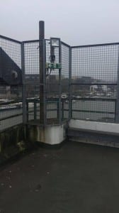
The location I decided to use was a car park as the lighting created a warehouse effect and also created a sense of unease which the limbo section in our show also generated. I chose to use Rob as the figure in the poster as he was the presenter character who was serious, focussed and created the world of escapism for the “contestants”.

P1070580

                                                                                                                                                                    Poster Option 1 (Nixon, 2017)

P1070529


                                                                                                                                                                    Poster Photo Option 2 (Nixon, 2017)

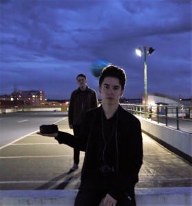
These images did not come out as I had hoped due to the cars taking away the focus of Rob and it also didn’t show the fun elements that consisted in our show. I decided to do a reshoot for the poster and changed location to the top floor of the car park and brought in Brodie who was the other presenter in the show. I also added a cake, balloon, pen, and headphones to show the four areas of escapism in the show.

 P1070623 P1070645 P1070648 (2)


Poster Photo Option 3 (Nixon, 2017)     Poster Photo Option 4 (Nixon, 2017)                        Poster Photo Option 5 (Nixon, 2017)


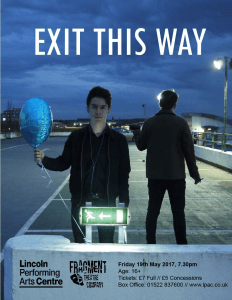
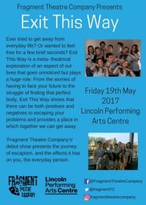
This is the final poster:

FRAGMENTPOSTER


Exit This Way Poster (Fragment Theatre Company, 2017)


At first I found it very difficult to make the poster as I had to teach myself how to use Photoshop. Luckily I had a strong image that did not need editing or any effects layered on the image. I decided to use a simple font as the image was the most important element to the poster. The fancier the font the less effect the image had.

At the start of the process our show had a more serious tone but as the show progressed it veered more towards a tongue in cheek style comedy. Although the poster still represents our show it steers more towards the undertones of the sadistic elements. If I could have created the poster at the end of the process it would highlight more that our show was a comedy.

Another marketing strategy we used was flyers! This is a great marketing method as “face-to-face contact is made… you physically hand out” (Layton Turner, 2006, 193); the flyers having personal contact with your audience. The more warm and friendly you are the better the reputation of your company. This will lead people to wanting to come see your show as they have a good first point of contact with you. For the flyers we again used the poster image to keep a consistent image going throughout all the marketing materials.


FRAGMENTFlyer


Fragment Flyer Side 1 (Fragment Theatre Company, 2017)


Exit This Way Flyer2


Fragment Flyer Side 2 (Fragment Theatre Company, 2017)


Works Cited:

Fragment Theatre Company (2017) Exit This Way Poster

Fragment Theatre Company (2017) Fragment Flyer Side 1

Fragment Theatre Company (2017) Fragment Flyer Side 2

Hill, E., O’Sullivan, C. and O’Sullivan, T. (2003). Creative arts marketing. 2nd edition. [ebook] Oxford: Butterworth-Heinemann. Available at: http://lists.library.lincoln.ac.uk/items/EB051E65-5BD4-50A0-63E2-4A766F27A8E8.html?referrer=%2Flists%2F2F819BDC-9061-08EC-AD65-4A8AF646E284.html%23item-EB051E65-5BD4-50A0-63E2-4A766F27A8E8 [Accessed 31 Mar. 2017].

Layton Turner, M. (2006). The Unofficial Guide to Marketing Your Small Business. 1st edition. New Jersey: Wiley Publishing, Inc.

Nixon, E. (2017) Poster Photo Option 1

Nixon, E. (2017) Poster Photo Option 2

Nixon, E. (2017) Poster Photo Option 3

Nixon, E. (2017) Poster Photo Option 4

Nixon, E. (2017) Poster Photo Option 5

Nixon, E. (2017) Poster Set Options 1

Nixon E. (2017) Poster Set Options 2

Nixon, E. (2017) Poster Set Options 3